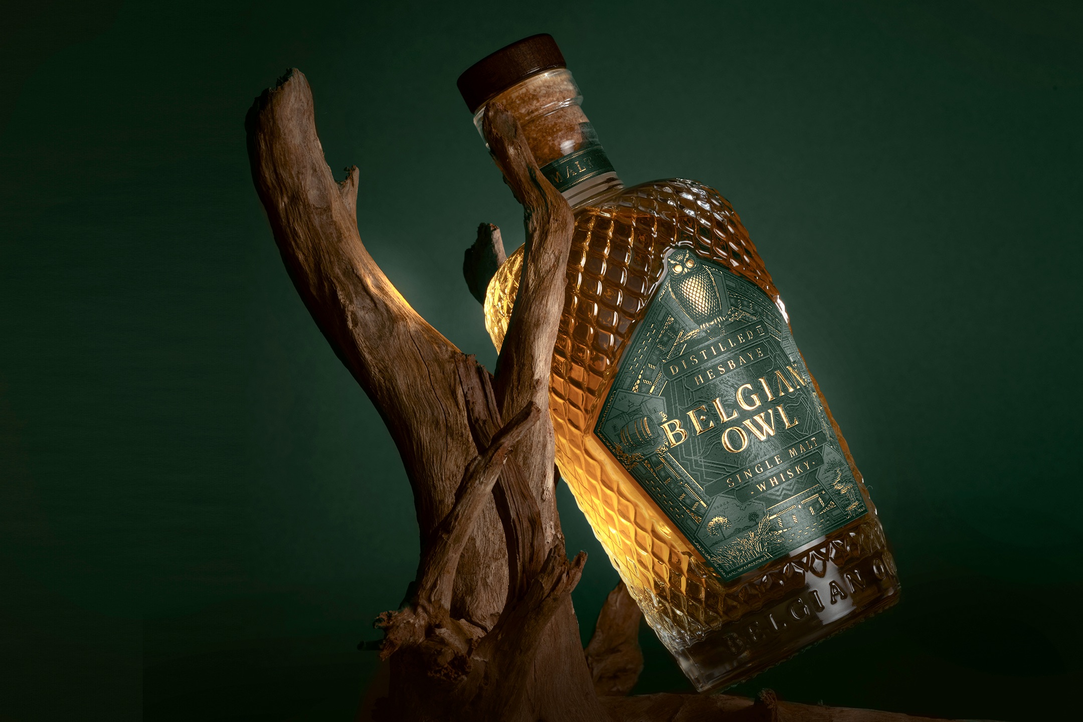
We were approached by the UK-based PR agency looking after Belgian Owl, a Belgian distillery based in the region of Hesbaye, producing a range of authentic, Scottish-inspired whiskies.
The focus of the agency’s approach was that the distillery had undergone a major rebrand and we were invited to run the story.
We agreed and we were also sent a bottle of their single malt whisky to sample and also review, which arrived in a stunning gloss white box, which carried the new branding.
Belgian Owl Single Malt is an exceptionally smooth and well-balanced whisky. On the nose there were hints of vanilla, a fresh fruitiness and dark smokiness.
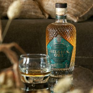 Moody, smokey notes underpinned the depth of flavour and delivered an almost earthy, but never unpleasant, mouthfeel.
The finish was exceptional – a pleasant reminder of mellow fruits, vanilla and honey, with a lingering smoothness tempered with smokey-sweetness that left you wanting to have just another sip and savour the experience.
When we first opened the box and removed the single malt, we had no idea if the whisky would match the expectations that the white gloss, beautifully-design box suggested.
The simple answer is that the whisky more than delivered and is one of the smoothest spirits we have sampled for a while.
Given that the designers had a quality product on which to unleash their creative talents, we asked the distillery how the project unfolded from their perspective and this is their response:
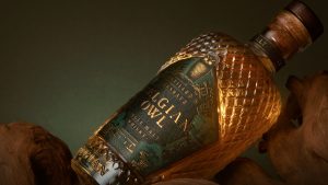 “When our company decided to go global, we realised that our current packaging wasn’t up to scratch. We contacted several marketing agencies specialising in international alcohol.
“However, we also wanted a Belgian agency to be involved in the process to remain in line with the brand’s values.
“We therefore selected WeWantMore in Belgium for the quality of their work on all their projects. After two meetings with WeWantMore, we knew we had found the ideal partner, one that listened to our needs and was at the cutting edge of creativity.
“Their graphic proposals were already extremely well-developed in the first drafts. Very quickly, the prototype of the current bottle was proposed and our team immediately fell in love with it.
“The subtleties of the label, the creation of the brand platform, the choice of colours and the shape of the bottle were all imagined with precision and talent.
“WeWanteMore [the design agency] supported us throughout the project, from the creation of the brand image and the packaging right through to the production line. Their holistic approach has resulted in a wonderful bottle that has deservedly won numerous awards. We are extremely satisfied with the designers and their creativity, but also – and this was fundamental for us – with their sympathetic approach to this important transition.”
WeWantMore responded to Belgian Owl’s brief and here at Hand Crafted Drinks Magazine we would say that they created one of the strongest and most iconic drinks brands that we have seen in years. This is WeWantMore’s story:
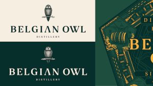
“When Belgian Owl approached us for their rebranding, we realised there was a huge untapped potential. It already had a small but loyal customer base among whisky connoisseurs, and multiple awards to prove it.
“Among them ‘Best non-scottish whisky in the world’. Their packaging, however, did not reflect this in any way, lacking both distinctiveness, storytelling and premium appeal.
“One of the main objectives of the briefing was to take the brand out of the niche, and make it appeal to a broad audience, since these connoisseurs only made up about 10% of the whisky-buying market.
“Actually, about a third of all whisky sales were gifts. this category of sales were driven mainly by the appeal of the bottle design and unique story.
“So, first we looked at the bottle design. Because Belgian Owl was already a bit of an odd one out in a brand category that was dominated by the Scottish whiskies, it meant that we couldn’t be too disruptive from a design perspective.
“The fact that whisky is a highly charged emotional product, driven by feelings of achievement, quality, craft and nostalgia, underlined this fact. [But], instead we chose to be disruptive within the category codes, using classic codes like intricate bottle design, embellishment, finishing and premium materials to create our brand.

“The second ingredient was the storytelling behind the brand. The story of the master distiller and originator of the brand, Etienne Bouillon, an ex-sommelier and whisky connoisseur with a relentless drive to truly craft the best whisky in the world, and inspiration for the wise owl at the base of the brand, the unique terroir of Hesbaye, that’s essential to create the exquisite whisky.
“So we created a brand narrative around the mystery of Belgian Owl, an anomaly that shouldn’t exist. Drawing inspiration from alchemy, an ancient branch of natural philosophy aiming to transform lead into gold and an evocative analogy for the process of turning barley into exquisite whisky,
“The concept of a whisky that was ‘not quite of this world’ was born.
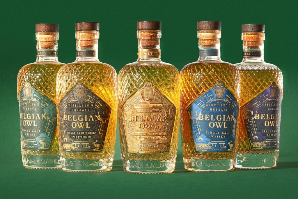
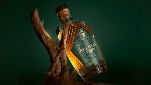 “The intricate label design and crystalline structure of the glass as subtle nods to Belgian art nouveau, and the feathers of the owl. The four elements as references to the distilling process, with the wise owl sitting proudly on top, overseeing the process.
“A combination of high-end CGI visualisation and traditional craft, with hand-drawn ornaments and illustrations allowed us to convince the client early on, and allowed us to focus on refining the final product instead of endless iterations.
“To ensure the highest quality, we worked with local and European packaging partners only, to make the design of the bespoke bottles come to life in the most sustainable way possible. In total, we created six range extensions – each with their own colour palette while maintaining a balance between brand consistency and uniqueness.
For more information visit the following websites:
Belgian Owl
WeWantMore
